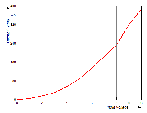
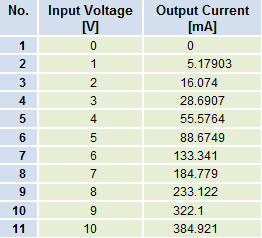
Displaying Data Graphically
You can place diagrams onto a sheet to display data in a spreadsheet graphically. You therefore specify the cell ranges for the Y values and possibly also the X values for the curves in the diagram. The process is similar when working with FlexPro. You set up a diagram in the project database using the Diagram Wizard and, in the process, specify the data sets to be displayed as curves in the diagram. Later you can add more curves by simply dragging and dropping data sets or formulas into the diagram. When doing this, FlexPro scales and labels the axes automatically, and comments, units, etc. are taken from the data set header information.
In addition to 2D and 3D diagrams, FlexPro offers you additional formatted column tables, cell tables and texts into which you can embed scalar values to display your results.
Next Topic
You might be interested in these articles
You are currently viewing a placeholder content from Facebook. To access the actual content, click the button below. Please note that doing so will share data with third-party providers.
More InformationYou need to load content from reCAPTCHA to submit the form. Please note that doing so will share data with third-party providers.
More InformationYou are currently viewing a placeholder content from Instagram. To access the actual content, click the button below. Please note that doing so will share data with third-party providers.
More InformationYou are currently viewing a placeholder content from X. To access the actual content, click the button below. Please note that doing so will share data with third-party providers.
More Information